
Transitions and Event Listeners
TL;DR
This event listener does exactly what it says. It listens for a CSS transition to end and then fires a function.
Item.addEventListener(‘transitionend’, function({ … });
If you would like a little more info and some use cases. Read on.
Transitions
First of all, what is a transition? A transition is a CSS attribute that will allow other attributes change from one to another in a graceful fashion. When we change a background color on hover it won’t snap between the two. They way to set it via shorthand is like so:
.button {
  background-color: slateblue;
  transition: background-color 0.2s 0s ease;
}
.button:hover {
  background-color: darkslateblue;
}
This will have the button fade from slateblue to darkslateblue. This, of course, is the shorthand and it is defined as such. transition: [attribute] [length of transition] [transition delay] [easting type]
You can also affect each part individually with the following attributes:
transition-delay /* time to wait before starting transition */
transition-duration /* how long the transition will run */
transition-property /* what property to affect */
transition-timing-function /* what type of ease to apply */
All of these are pretty straightforward except for the timing function and we’ll go into that next.
Transition Timing Function
The transition timing function is what the browser will use to interpret the inbetween frames of the transition. It knows it needs to go from one point to another but this property will tell it what kind of journey it will take to get there. This process is known in the animation industry as easing and it is how animators make things feel like they are alive and not built by a computer.
Most programming and animation packages will default to linear. This typically makes animations feel robotic and unnatural. CSS was makes our lives a little easer and defaults to ease.
If you are ever curious about what kind of easing is applied, you can click the little icon after you set it on transition-timing-function and it will expand to show you a graphical interpretation of the timing.
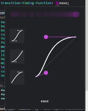
As you can see with the graphic above the default ease has a curve to it and isn’t straight. You can interpret these graphs with the Y axis being the transition-property changing from one value to another and the X axis being the transition-duration. The transition goes it runs from the bottom left to the top right. So, with our example of ease we can see that it starts slowish then accelerates to even out near the top and slow down as it finishes the animation. There are several keywords that we can use, and they will go far in getting the results you are after.
ease- slowish start, slow finishease-in- slow start, linear finishease-out- linear start, slow finishease-in-out- slow start and finishlinear- linear animation (good for spinning animations)step-start- choppy animationstep-end- choppy animation
MediaWorkbench has a really good video explaining these lines. It’s for after effects but the principles are the same. Some of the animations are not available in the keywords, like a simple bounce animation. Here you will need to use cubic-bezier.
Cubic-Bezier
Cubic-bezier will allow us to choose our own timing function by setting the path as we see fit. You can play with it in the browser or at Cubic-bezier.com. For us to make a simple bounce, we would use the following CSS.
transition-timing-function: cubic-bezier(0.175, 0.885, 0.32, 1.275);
Here is how the curve would look:
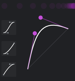
It shows that the line goes up above where it is supposed to go and then back down. So if we had something that was moving in the Y access it would go past its target value and then back down to end at where it is supposed to.
Animations and easing
There is a way to achieve very custom easing functionality, however - it is out of the scope of this article but I’ll send you to a free resource to experiment with it. It is easings.net - here you can copy and paste code to give you some very professional easing animations. Like the ones you saw in the video by MediaWorkBench. Although, now that I’m looking a little more at it - you can get a lot out of cubic-bezier.
Transition End Event Listener
Okay, now that we know a lot about transitions in CSS we can get to the JavaScript. Once everything is said and done with our transition, JavaScript can listen for it to be done and fire off a function.
Below is an example to illustrate the timing difference when you just Google a class vs when you wait for a to finish first.
What I love about this is it is a bridge between CSS and JS, something you don’t see a whole lot of. It has been supported for a long time, since IE10 - so you are safe when you want to use it.
My main use for this is because display and visibility are not animatable and changing their values with a class will break all transitions or animations you have applied to an element. A good example of when this is needed is when you have a mobile nav sitting off to the side of the page - you don’t want it to be navigated to by the keyboard so, traditionally, you would use JavaScript to set all the tab indexes to -1. This works for sure and lets us animate the nav sliding in from the side. However, it would be better if we could set the whole thing with a display: none and be done with it. And we can.
So the way we kick this off is by having a nav sit off screen that slides back on when axtivated.
nav {
  position: fixed;
  top: 0;
  right: 0;
  transform: translate(100%, 0);
}

nav.active {
  transform: translate(0, 0);
}
Now we need a class that will toggle the display attribute for us to apply when the animation is done.
.hide {
  display: none;
}
Now with our JavaScript we listen for the transition to end and apply our house class.
const nav = document.qurrySelector('nav');
nav.addEventListener('transitionend', function(){
  this.classList.add('hide');
});
Seperate from this we will need our click event that will add and remove the active class. When we are showing the nav we can just remove the hide class and then apply the active class. This works because JavaScript works in a linear fashion and the display is taken care of AND THEN the animation is applied. When we work on reverse, it will break things.
I’m sure you were thinking that we could use transitionstart event listener, and we could it just isn’t necessary in this case.
For performance
I’ve also used this to make things more performant when using transitions. In this codepen:
Oh No, Overflow by Bruce Brotherton (@brucebrotherton)
on CodePen.
The browser was having a hard time rendering the nav with a blurred background as it slid in. So I attached a transitionend listener to it and applied the blur when it was fully in frame.
Conclusion
So we touched on transitions and the transitionend event listener. And now you know probably a lot more than you needed to fit the timing function. This is one of my favorite things in CSS because it makes the page feel more alive I hope it helps you in you web dev journey. That’s all for now.