Border-image is one of those attributes that I rarely reach for because of how convoluted the syntax is. I mean look at this.
border-image: url(…) 30 30 / blah blah blah
What in the world is with so many values? Why do I have to specify the width? How do I figure out what the slice should be? What is a slice even?
We’ll cover all these things and more in this article. But really this all starts with the image part of border image.
TL;DR You can find all of my code pen examples inside this collection at CodePen.
Creating a proper image
The border image is made out of essentially two parts. The corners and the sides. The corners can either be created as terminating points or as connectors to the sides. Deciding what type of corners you want to use will likely impact what type of border-image-repeat you’ll end up using. MDN has a good graphic of what the image parts will look like while they talk about border-image-slices.
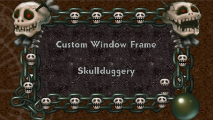
Simple Border Image Here is an example of a border image that you might see in a Pokémon video game.
And it would be pretty straightforward how to implement this in a border image.
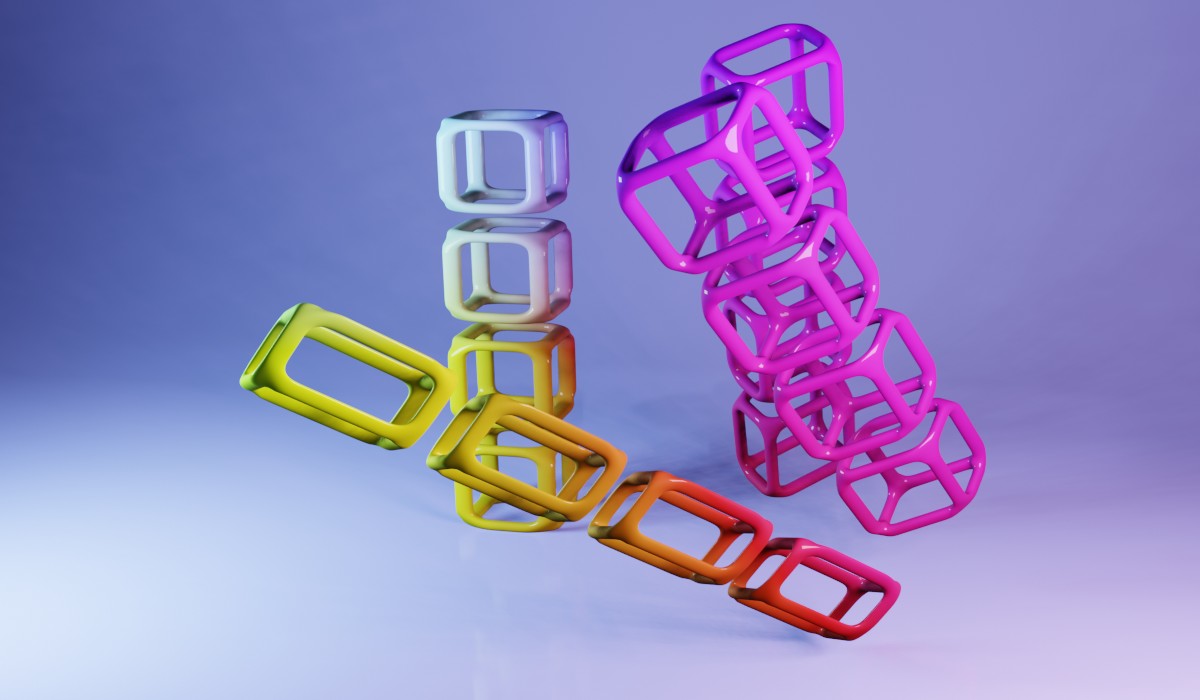
Complicated Border Image More complicated border images like that of Chrono Cross.
You will have to worry more about how the edges are going to tile and what will be acceptable when they meet the corners.
This type is best used when you know the exact dimensions your box is going to be. As the video game did.
Single Line Borders This is a simple use for border images that I think is actually one of the most useful. Applying it to one edge so that you don’t need to worry about the corners. Say if you wanted to draw a line of curly ques that can just repeat for infinity under an element.
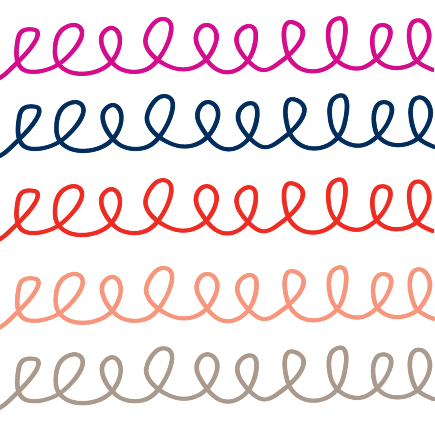
This can add a lot of character without a whole lot of work.
Gradients as border images Lastly we can pump in the CSS linear gradient as a background image and make so really neat effects.
Going over the properties
Now that we have the complexity of what kind of image we want to use in our border image we can move h http the properties. Keep toddy images in the back of your mind as we go through them and think about how each would benefit per property.
Border shorthand
The typical border: 1px solid black will overwrite these properties. So if you plan to use it make sure it is declared first. Otherwise, you need to make sure that border-style is set otherwise the border-image will not appear. I suggest also setting border-width the size of your image so the border-image will have something to fill into as well as give a fallback.
Border image source
This one is pretty straightforward you can do a url(…) or a gradient. Same as a background image. A nice feature of this is that if it is set to none or can’t be few found the regular border styles are used. That makes it easy to have progressive enhancements be strong with a border-style as a fallback.
Border image slice
If you aren’t familiar with photoshop you might have never heard of slices. The only time I had to use them was when I had to chop up images so they were the right pixel size for HTML emails.
This is the bread and butter of border images. Once you wrap your head around this you will be ready to make some excellent designs.
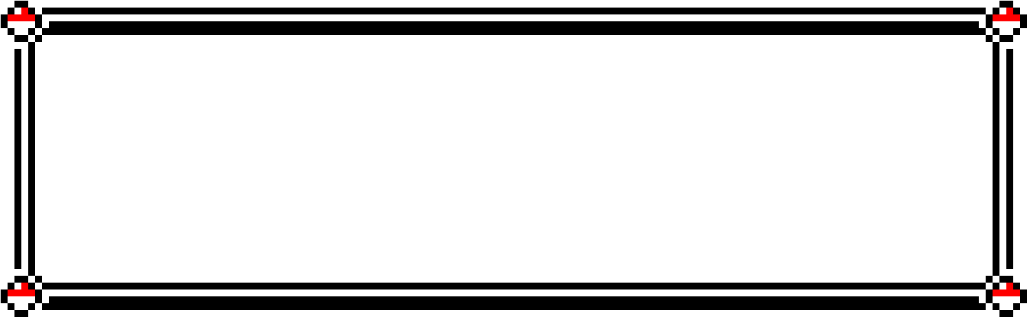
Looking at the image above the image slices go like this
border-image-slice: Line from the top, line from the right, line from the bottom, line from the left.
Now the values you use for these are similar to what you would use for the inset value. In the manner that you would consider how many pixels from its respective border is the line. For example, our case with the image above we would have
border-image-slice: 110 calc(440 - 350) calc(240 - 160) 125;
Those were of course eyeballed, I had to finesse them a little more in the code and ended up more like.
border-image-slice: 110 calc(440 - 325) calc(240 - 152) 125
You could simplify this and work out the calc functions to make it:
border-image-slice: 110 115 88 125
Notice all the numbers are unitless, that is because we are working with a bitmap image that has defined pixels so the given unit is in pixels. However - you can also use percents and rems if you’d like. This is similar to when you are making an SVG using the polygon parameter. We know the viewbox here so the numbers given will correspond to it.
SVG Images and Slices It is possible to put SVGs into image-backgrounds. Because we set the width and height on an SVG, how we definitions our “pixels” in slices work just the same way as it would a bitmap image. Keep in mind that if you change the width and height so will your slices. Heck I’m this case I could have used CSS variables even and adjusted how each of the SVG rectangles were made to have further control.
Fill keyword
The fill keyword will make the center of your border image appear. Similar to a background image.
border-image-slice: 42 fill;
Border image width
The border image width, by default is set to auto andwill try to be equal to the intrinsic height or width of the slice it is on. However, you can also set them manually.
border-image-width: 110 115 88 125
When applying the border width it is similar to the same way you can set the border-width.
And it is recommended you set the border-width as well so in case the border image isn’t supported in a browser, it will fallback to the border and still have an impact.
If you set the border-image-width larger than the border-width it will extend past the border-width and padding. Since the border-image receives no pointer events you may have some unexpected results when you do this.
Border image outset
Works similar to border-offset however, you have the ability to set each border’s outset individually. So if we needed to push this outset more horizontally for whatever reason we could set image-border-outset: 15px 30px 15px 0px and that will give us room around the top, bottom, a little more on the right, and none on the left. Keep in mind though that this won’t move other content around the border so you will also have to set a margin to push stuff around.
Border image repeat
The border image repeat as some unique keywords that aren’t used in many other places.
stretch
This will have the image stretch from one end to the other.
**** repeat
This will make the image repeat with no changes to try and make the edge match the corners.
**** round
This will repeat the edge but if a whole tile dosen’t fit they will stretch to fill the area, ensuring the edges of the image will match the edge of the corner.
**** space
This will repeat the edge but if the whole tile doesn’t fit it will add space in-between the tiles in order to distribute them evenly. Similar to justify-content: space-between.
Making a Simple Border Image
A lot of the other websites out there use a dot or diamond pattern to show how to use the border-image property. However, I think that just having fancy corners can set your content apart so we will go with recreating the Pokémon border that I showed earlier.
First we want to start with the image, we want it as small as possible so were going to cut out a lot of the space in the middle.

This is pretty square and that will allow us to reduce how complicated we make the border image. Its 39 pixels from the each corner to the line that I want stretched between them. That lets me set the image-slice to 39. Which is shorthand that will set the slice 39px from the top, 39px from the right, 39px from the bottom, and 39px from the left.
And since I know I want to stretch the line that will set up the border-image-repeat to be stretch. Now there is two ways to go about this. If I want the border to take up space on the page I would set up the rules like so.
.pokemon-box {
  border-style: solid;
  border-width: 39px;
  border-image: url('pokemon.png') 39 stretch;
}
In order for the border-image to show we need to set border-style: solid.
I opted to use border-width to set the size of my border-image, and this will make sure that my border will take up space on the DOM.
An alternative would to be to set the border-image-width and that will allow me to have the border without affecting the layout. However, we will then need to set the border-image-outset as well so the border is pushed outside of the element and isn’t covered by the content. Using the slash notation for the shorthand below it is in this order: \[image\] [slice] / \[width] / [outset\] [repeat]
.pokemon-box {
  border-style: solid;
  border-image: url('pokemon.png') 39 / 39px / 39px stretch;
}
Animated GIFs and border-images
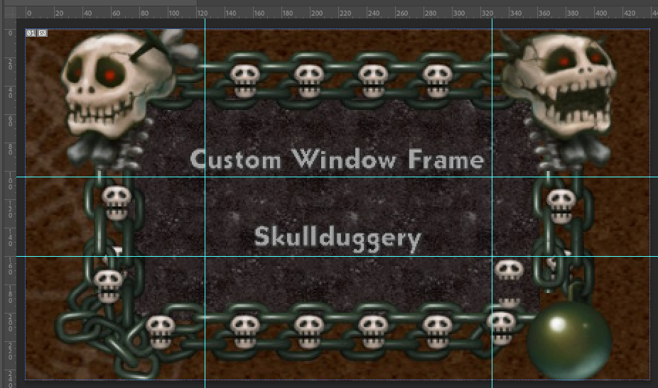
There is a caveat to using animated GIFs as border-images, you can only have the corners being animated. This could still produce some cool effects. For example - the skullduggery border we showed earlier could have the big skulls open and close their mouths. But since I’m not an artist with a lot of time. I put together this Mario Star example for you to check out.
Here I set the border-image like so:
div {
 border-image: url("https://data.whicdn.com/images/220555186/original.gif") 100% / 0 5rem 5rem 0 / 2.7rem;
}
The thing to note here is that I set the border-width: top: 0 right: 5rem bottom: 5rem left: 0. That way it made sure there was no star on the top left, top right, and bottom left, only on the bottom right. I set the border-slice to 100% so it used all of the image for the border and since that made it create no slices for anything but the corners it leaves them not visible. So in order to get a border-like effect, I made a box-shadow: 0 0 0 5px goldenrod.
Single Border Images
This was the original reason I reached for border-image in 2014 and was boggled by the syntax of it. I wanted to have a line that stretches along the bottom of a Nav but it was a bunch of curly Qs. At the time it was just a bunch of trial and error to try and get it working and I never wanted to touch border-image again.
Border Image Gradients
Using gradients for border images is pretty straightforward at this point:
.gradient-border{
  border-width: 1rem;
  border-style: solid;
  border-image: linear-gradient(red, blue);
  border-image-slice: 1;
}
And honestly, Chris Coyer wrote a great post about gradients in border images.
Still I was curious about some cool applications for this so here is a codpen to play around with. I went ahead and tried to recreate the SVG example earlier using a conic-gradient. Then I also noticed that if you try to use a radial gradient you will need the border-width and the border-image-slice to be the same otherwise you’ll get some funky results. Similarly, with the repeating-linear-gradient you’ll want it to repeat at the width of your border as well as having the slice that size to keep things from going awry.
Final Notes
Two quick things Border-image isn’t affected by by border-radius. Stephen Shaw has a good work around. Also, you can’t have two slashes in the shorthand with nothing in-between them. For example: border-image: url(…) 30 fill / / tile will be invalid. According to the W3C Spec for border-image it runs like this <'border-image-source'> || <'border-image-slice'> [ / <'border-image-width'> | / <'border-image-width'>? / <'border-image-outset'> ]? || <'border-image-repeat'> so if you omit a slash it will be filled with another value. I would recommend reading the whole spec for border-image - it has a really cool example of a complicated border you could design.
Something that you will need to keep in mind while developing your border-images is how you want the background to be treated. You can use background-clip: padding-box to push the image inside of your border so there won’t be any conflict with it and your image.
Go forth and build a better box
I hope this post has better quipped you to work with one of the most confusing properties I’ve ever come across. I had a joy writing this and have come away with more knowledge to use in my own projects. That’s all for now.