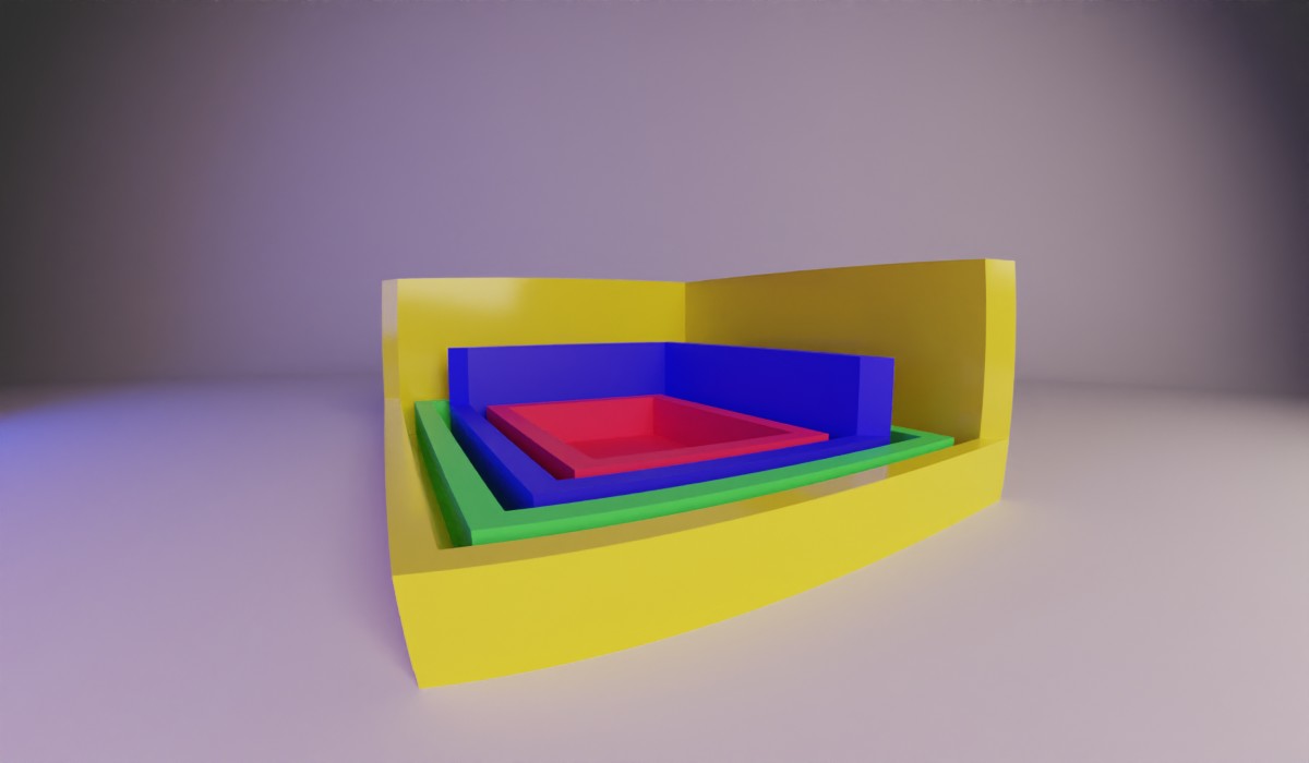
Margin and Padding are pretty much two sides of the same coin. There are a lot of similarities with only a couple of exceptions. We’re going to dive into the finer points of what you can and cannot do with these two properties as well as some fun tricks you can do with them.
Setting Values
So the way you can set your margin and padding is essentially the same. They accept just about any type of unit.
Longhand:
  padding-top: 10%;
  padding-right: 1rem;
  padding-bottom: 10px;
  padding-left: 10em;
  margin-top: 20px;
  margin-right: 2em;
  margin-bottom: 2rem;
  margin-left: 20%;
I know that these are pretty straightforward on how to do them but WHY would we set them like this, eh?
Typically I set individual margins and paddings when I’m not sure about all the other things that are applied to a component. If you are lucky enough to never inherit a legacy code base, awesome. But most of us want to break as little as possible when we make a change in CSS. So when an image for some unknown reason is pushing content way to the right we’re gonna wanna target its right margin and only its right margin. Until we can figure out the root cause of the problem. Otherwise, I will use the shorthand methods.
Shorthand:
  padding: 10% 1rem 10px 10em;
  margin: 20px 2em 2rem 20%;
There are also a few other shorthand ways you can set the margin and padding. You are able to set the property with one, two, three, or four values and each one affects it in a different, however, predictable manner.
Shorthand Explained
One Value
One value will set all four sides of the margin/padding. So if you set margin: 1rem you’ll be setting it across all sides making an even space all around the box.
Two Values
Two values will set the top/bottom and left/right values (in that order). An example is when you set the padding on a button, you’ll typically want more padding to the left and right than the top and bottom so you’d pass it padding: 0.5rem 1rem;
Another popular use of this is when you want to center a div horizontally. There is a few things to set before you can tho. First, your element needs a set width or max-width. Then you can set the margin to margin: 0 auto this will center your div horizontally. The way auto works here is that it will tell the margin to fill as much space as it can. And since it is on both sides they’ll even out and be looking fire. Now you may be thinking why can’t we set margin: auto on this and center it vertically as well as horizontally. Well, that is because margin-top and margin-bottom are set to 0 when they are auto. Womp-womp.
Three Values
Three values will set the top, left/right, and bottom for the element. I find this useful when I want to center something but also put some breathing room between it and the thing below it. margin: 0 auto 1rem
Four Values
When you write them out they go in this order. Top, right, bottom, left.
Fun fact, I order them in that way when I declare them individually like at the start of this article and when I’m setting positions.
I’m going to be honest, I don’t set four values often, and when I do it’s because I want to set the left side to be different from the rest but don’t want to run two declarations.
  /* Instead of this */
  padding: 0;
  padding-left: 1rem

  /* I write this */
  padding: 0 0 0 1rem
I don’t know if it’s more efficient or reads better but it’s one less line, so I feel like it’s a win.
Some Differences
So padding, like content, will not allow you to use negative values - they will just calculate to 0. Margin, on the other hand, will. This is super cool when you are floating an item and then you can put a negative margin on it and it’ll pop out of the content.
Vertical Percents are Weird
When you put in a percent for the margin or padding it actually is a percent based on the width of the element, NOT the height. This is odd - but we can use it for some fun things like setting up an aspect ratio placeholder for when we lazyload images.
Thankfully we now have aspect-ratio and no longer need to do this hack (unless you need to support IE . . . still). It is still worth knowing how it’s getting calculated when you are setting it.
Margin Collapse
Now I’m going to write a whole blog post about margin collapse later, but right now it is good to know that if you have two margins next to one another, the smaller one will collapse into the larger one. So, if you have a paragraph tag at the end of your div with a margin-bottom of 2rem and the next div has a margin-top of 1rem it will choose the padding of the paragraph tag. To prevent this set the parent of the paragraph to be display: flow-root this will preserve both margins. I like to use this on my main column so when I butt it up to my footer the behavior of the last element is predictable.
Final Note
The last thing that you might be tempted to do is to move an element using margins. And you can, but it is tough for the browser to render that motion. If you need to move something with an animation, it is suggested to use transforms to achieve the 60 frames per second because they are the easiest for the browser to render.
Also, the final header image for this was supposed to be something else but - it didn’t go as planned. That’s all for now.
