
TL;DR
CSS regions let you set a chunk of content and define regions for it to flow into. It is a similar behavior to what you are able to do with text in Adobe InDesign. There is a Polyfill from FremyCompany that will allow you to do it in modern browsers. You can keep reading if you want to know more of the ins and outs of about CSS Regions. Otherwise there is this CodePen by Austin Walhof that incorporated the JS with a working example of the HTML and CSS. However, I would warn against using it right now. In an article by Håkon Wium Lie, CSS Regions Considered Harmful, it details the the reasons why Regions should be avoided. And I think that better forethought could achieve the same or at least a super close, better result.
A Little About CSS Regions
Of all the obscure CSS properties out there. This one is a hidden gem and part of our history. Its one of the properties that only IE supports, and even then - not really. I mean look at the support from Can I Use:
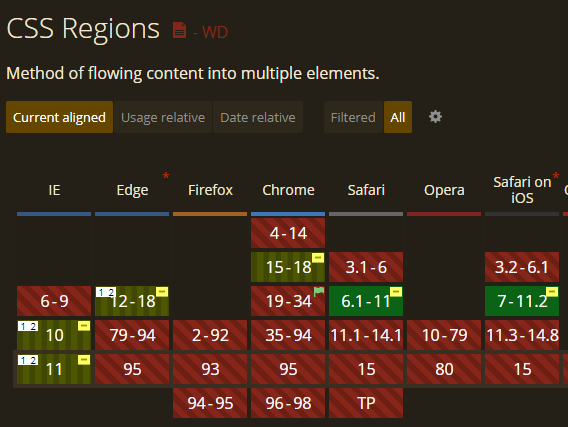
Spoiler alert, all the browsers not in the screenshot are also showing CSS regions are unsupported. CSS Regions were first proposed by Adobe in 2011 and rejected by Google in 2014. Now that is pretty much the bookended story of Regions but during that time they had a bit of a run through prominent in the web-o-verse. First, I want to address what they were and why the web could use them
What Were Regions For?
Regions, according to the Regions W3C Module were to allow for content from one or more elements to flow through one or more boxes called CSS Regions. So in theory, you could have a chunk of content and then let it flow freely through a bunch of divs as it sees fit. Now, what set this apart from other layout options is we could put these divs that if flows into wherever we want in the HTML structure.
This would allow our websites to closer emulate magazine or newspaper layouts. Where we can just define containers for our content and the browser will fill in as it goes. To make our layouts break out of the box and column rut. To be fair tho, the box and column rut is awesome because whoo boy trying to make these regions work for all screen sizes and let users put in whatever they want would be a doozy. Also having a predictable reading pattern really helps users navigate the webpage, and that’s kind of the reason why we make them. But I digress, one of the things the web is trying to compete with is the printed page, there are so many amazing layouts that we get to see on a page because they know the exact width and height of what they are working with. Of course, we don’t have that luxury on the web, and Google rightly foresaw that mobile was going to be a major player online. With over 50% of online traffic being mobile, a cool magazine layout would get squashed into a single column.
Still, this was back in 2011 and the desktop reigned supreme, our typical frame was 1920x1080 or something very close to that aspect ratio. So we honestly could design something that looked like a magazine page for our users and they would get something they understood. CSS Figures has a really cool article about how we could build out a multicolumn layout using regions.

And we can almost get some really great multicolumn layouts going without Regions, just by using the column CSS property. However, for long form content it isn’t very viable, you’d have to scroll from the bottom back to the top to read the next column. Now, I’ve made a small demo on Codepen that would break it down to a single column when the viewport is too short. And for a lot of purposes that may be enough. But what I would like is for a max height of the column (say 50vh) and it would wrap into a container with three more columns continuing the story. And that would have been possible with Regions, if a little bit of guesswork to get how many regions needed to be set up.
So we could do something like this:
<div class="content">

  <!-- These are our containers -->
  <div class="row">
    <div class="column region"></div>
    <div class="column region"></div>
    <div class="column region"></div>
  </div>
  <div class="row">
    <div class="column region"></div>
    <div class="column region"></div>
    <div class="column region"></div>
  </div>
</div>

<!-- This is the text we want to pour into our containers -->
<div class="text">
  <p>...a bunch of text...</p>
</div>

<style>
  .region {
    /* Take the flow from our regionPour */
     -webkit-flow-from: regionPour;
  }

  .text {
    /* Whatever is in our text, flow it into our regions */
     -webkit-flow-into: regionPour;
  }
</style>
Note that the ‘name’ of the flow is arbitrary we just need to know that the region starts in .text and goes into our .region class, it will accept flow from regionPour think of it putting glass bottles in the glass recycle bin. Only glass can flow-into go into the glass container. And when one bin is full it goes into the next.

Now this is the expected use of Regions and it was kinda bad. It required a bunch of placeholder divs that are just hanging out in space. Not is this only not semantic, it leaves a really bad code smell when looking at it. However, some people have thought of some other uses that Regions could fill besides just flowing in text through empty divs.
Use Cases for Regions
Now this isn’t to say that Regions were good for nothing. There are a couple use cases where they would save us a good amount of JavaScript if we were able to flow things into other regions when combining it with a media query. Lets talk about two here.
Content Folding
Chris Coyer wrote an article called Content Folding that gave a legitimate reason to keep regions around. The basic idea was to move things from the sidebar into specific regions throughout the content and then making the asides and ads more content aware for smaller screens. Of course this doesn’t solve the empty div situation but Sara Soueidan recommended a solution where you would have them flow into the ::after element and that would clean up that problem.
Responsive Navigations
Another use case that Sara Soueidan brought up was flowing menus into a mobile navigation vs a desktop navigation. Some mobile navigations that we see on the web are a duplicated version of the desktop navigation, Regions will give us the ability to flow them instead of duplicated the general structure. And as an added bonus to flowing this content we could style it after it gets floated.
/* region-specific styles */
@-webkit-region #regionPour {
  .my-nav a{
    color: white;
  }
}
So this would turn all our text to white after it got flowed into the region. Super cool for our menus this way we can have one navigation, two sets of styles and two places on the page. With the added bonus that of it being in the same place structurally in the HTML.
The Downfall of Regions
As I stated at the beginning, Google pulled the plug on Regions from Blink in 2011 because they needed to focus on mobile and mobile efficiency. In that vein they wanted to make the web more viable for applications. Today, web apps are dominating, even apps you use every day are beefed up web pages, like Facebook (made with React) or Fitbit apps (made with JavaScript). So focusing on the web as an app interface was a good call. That being said, expressiveness has been limited or as Jen Simmons puts it,
“Remember when things used to be much more punk rock?”
and on the threshing floor lies Regions because they just don’t fit in the world where people read in an F pattern and not in a Z, an N, or a swirl pattern. Magazine layouts on the web, while they look cool - would inhibit a user from finding what they were looking for in the first place.
In Conclusion
There is a strong argument for interlacing aside content into specific spots for responsive design, instead of putting it all at the footer when on mobile and for that reason I can’t say Regions should be forever abandoned. Not to mention that we have 2k, 4k, and 8k monitors that could take advantage of a magazine layout for our entire page or article, though regions may not be the best fit, considering that our 1080p and below screens would not have that luxury.
If I were to propose CSS Regions today I would probably piggyback off the display property. Where it would be display: grid region or display: flex region where elements that overflow continue into the next grid item or flex item. This way we set up our spots that block where the text can’t go and it continues on into where it can go. It would be a simpler version of CSS shape-outside. Now I am aware that this is not the same as regions as they are so maybe it won’t even be called regions. I am just spit-balling what I would want it do if I could resurrect it 🧟♂️. This kind of method would make floating images in the middle of text super simple. Or… AH CRAP I just want to use floats. Thats all for now.
Resources and additional reading.
I used all of these links to research Regions, the way people were using them, its history, and what was wrong with the whole idea. If you are interested in them I’ve organized them in the ones I’ve referenced the most to least.
- CSS Regions Matter (sarasoueidan.com)
- Content Folding | CSS-Tricks
- Reversing course, Google rejects Adobe Web publishing tech - CNET
- CSS Regions Considered Harmful – A List Apart
- Killer Responsive Layouts With CSS Regions — Smashing Magazine
- https://webplatform.github.io/docs/tutorials/css-fregions/
- https://codepen.io/ajwalhof/pen/adc5936118b8bd0edeb50b71493711d1
- https://drafts.csswg.org/css-regions-1/
- https://github.com/FremyCompany/css-regions-polyfill
- Web Archive of resources that no longer exist on the web
- https://web.archive.org/web/20130729113826/http://adobe.github.io/web-platform/samples/css-regions/
- https://web.archive.org/web/20130731045805/http://adobe.github.io/web-platform/samples/css-regions/basic/single-flow.html
- https://web.archive.org/web/20130629130133/http://adobe.github.io/web-platform/samples/css-regions/basic/multi-flow.html
Shoutout to Austin Walhof for helping me find information on this. I couldn’t even remember what it was called.