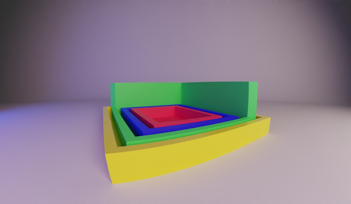
And now we are at the final and my most favorite part of the box model, borders.
We have a range of things to go over the border with type or style and colors and widths. In the end, I’ll try and cover some not borders that we can use to not affect the box model.
The first thing is let’s go over how to set borders. It’s pretty straightforward to set up a border around the whole box. 1px solid black. That is my most typical reach for the setting when I’m putting on borders. The “1px” sets the width of the border, “solid” sets the style, and the “black” sets the color.
It’s good to know that the order doesn’t matter but I almost always set it this way to keep things consistent. As long as you are consistent your coding will be predictable.
However, let’s break these things down into their pieces.
Border width
The border widths default setting is thin. However, you can also set it to medium or thick. Browsers don’t have any rule to follow for how many pixels thick each setting is. Only that they have to follow the pattern that thin is thinner than medium and medium is thinner than thick.
Of course, you can set the width with a px, ch, rem, or em. But not percent.
If you are using the property on its own, you can set each border width individually
Border-width: 1px 0.5rem 1em 5px;
This follows the same pattern as margin and padding. Top, right, bottom, left. That means the top would be 1px, the right 0.5rem, the bottom 1em, and the left border 5px. You also can shorthand this just like margins & paddings.
Border-width: 1px /* 1px border all around */
Border-width: 1px 5px /* top/bottom border 1px. Right/left border 5px */
Border-width: 1px 5px 10px /* top border 1px. Left/right border 5px. Bottom border 10px */
You can set the width to 0 to prevent it from taking space or displaying. However, that isn’t the reason why we don’t see borders on all our stuff all the time. Remember, this is set to thin by default.
Border style
Border style is what determines if a border is displayed or not. By default, it is set to none on most elements for example, things like tables have it set to solid. With it set to none, it forces the border to take up no space and not display.
However, there are a bunch of styles you can set a border besides solid.
I know in today’s flat, material design that solid is the most desirable but if you don’t know your options how can you be confident in your choice?
/* Keyword values */
border-style: none;
border-style: hidden;
border-style: dotted;
border-style: dashed;
border-style: solid;
border-style: double;
border-style: groove;
border-style: ridge;
border-style: inset;
border-style: outset;
Some of these styles require a larger width to be truly visible, like groove, it takes the color assigned and makes one-half of the border lighter. If the border is only 1px wide it’ll show one color.
Just like the width, we can assign them all in different ways.
border-style: solid groove double dashed
Border color
This is probably my favorite property of borders. It, by default, is the color of the text or currentColor. And I love this because most of the time when I have a border around a button, keeping it the same color of the text inside is exactly how I want it. So to set that we can simply say
border-color: current-color;
Or we can set a color.
border color: goldenrod;
Still, just like the other attributes we’ve been seeing we can set borders individually.
  border-top-color: red;
  border-right-color: green;
  border-bottom-color: blue;
  border-left-color: purple;
Or if we wanted to set them all at the same time we can use the same shorthand we’ve been using for the other box model elements.
border-color: red green blue purple /* top: red, right: green, bottom: blue, left: purple; */
Keep in mind with colors though, if you don’t have a width or a style you won’t see it.
Last for the border color is a very useful keyword: transparent.
This has solved many problems with hover styles on buttons that get a border but wouldn’t have one otherwise.
What happens is the content either surrounding the item or inside the item gets adjusted to accommodate this new space the border is taking up. However, with transparent we can reserve this space without rendering the border in the unhovered state.
This is essential to how we make arrows as well.
Arrows with borders
Arrows a fun exploit of the box model that we can use to our advantage. To be honest, they are triangles, but they are super useful in creating nav items or comic book bubbles.
These arrows hinge on the way the content box is constructed and its limitations. First, we know that the content can’t be less than zero. So, we have no content in the element we turn into the arrow. Next, we make sure there is no padding, there isn’t because we didn’t add it in the case above. This will ensure that the inside of the content box is 0. Then we get to add in the styles for the border. Since these can push outside the width of the box they are what give the store it’s shape. Elements’ corners have an angle to them similar to how a cabinet does. This is important to understand this to manipulate it into an arrow. This js fiddle shows what these corners look like and illustrates them as they get smaller.
As you can see the content continues to squeeze in to accommodate the size and the border stay the same width, eventually ending up with 4 triangles.
And this second js fiddle will show what happens when we set the border-bottom-width to zero. You will see we now have three triangles then we will make the left and right borders transparent and viola we have an arrow pointing down.
Not Borders
One of the main functions of borders is to signify the separation of elements. But sometimes a border causes too much shifting and you need an outline that doesn’t take up any space on the page. Usually, this kind of thing is needed for when you are coding for accessibility, and you need an outline around an item that is focused.
Outlines
Lucky for you we have the outline setting. This is very similar to borders:
outline: 1px dashed black
and that will set an outline that has dashes around an element but won’t push anything in any direction. There is one thing that the outline has that I wish the border did, outline-offset this will allow you to make the outline larger or smaller based on what you put in this property.
outline-offset: 2px
Box-shadow
Second, we have box-shadow I know usually this is a blurry drop shadow to show something being above or below a piece on the page. However, did you know there is another part to the box-shadow, it’s spread? This will allow us to go outside our element with the shadow and give it some separation from other items.
My favorite use of this is giving it a very subtle, transparent border around images so if they are white on white you can still tell where the edges are.
box-shadow: 0 0 0 1px rgb(0 0 0 / 5%);
Background Clip
Something to keep in mind is an attribute called background-clip it dictates how the background is painted within an element. Its default value is border-box which means the background will paint to the edge of the border. If you prefer the background to be contained inside the border use padding-box. This way your border can be treated more like the outline of the element but not use the outline property. Lastly, there is content-box which will move the background into the element and only take up as much space as the content area. And one more that isn’t related to border, background-clip: text and this will give you a really cool text cutout effect.
Border Radius
Okay, so there is one more thing I want to touch on before wrapping this up, that is the border-radius. It doesn’t affect the box model, but it makes a huge impact visually. This property allows you to have curved edges on your boxes or circles for that matter. Just make sure you have position: relative; overflow: hidden; it in case you put another thing inside this that has a background color. If you are looking for a fast and fun way to make some organic-looking shapes using border-radius, I would use Mirko and Nils border radius generator. However, like my dropdown menu example, I like to make elements just a little rounded and pill-shaped to make it fun more subtly.
Conclusion
As you can see the box model has a lot going on inside it and there are many ways to manipulate it. Borders are the most visible parts of the box model and carry most of the weight visually. There is a lot of play with borders and a lot to just fool around with. They also are used all over the place to help separate content from other parts of the page. I mean just look at any website and see how things are compartmentalized just with simple borders everywhere. That’s all for now.